
Case study
View all

M+C Saatchi asked me to lead the redesign of the Department for Energy Security and Net Zero’s Save Energy at Home service.
The challenge
The Save Energy at Home service is a key part of the government’s wider net zero push, aiming to help millions of households move away from fossil fuels and install alternatives such as solar or heat pumps.
Research showed that the service’s website (the main public touchpoint) was not meeting users’ needs. People found the experience overly bureaucratic, difficult to navigate, unclear, and hard to extract practical information from.
My project role
Working with a small M+C team, I led the project end to end, shaping the direction of the redesign and translating research into a clearer, more usable service.
I ran large-scale workshops, defined the UX and visual direction, created a scalable template system, planned and undertook the user testing, and carried the work through iterative refinement and into build.
Activities
View all

Project leadership
User research
Workshop facilitation
Creative direction
User experience design
Product design
Information architecture
User interface design
Rapid prototyping
User testing
A renewed creative direction
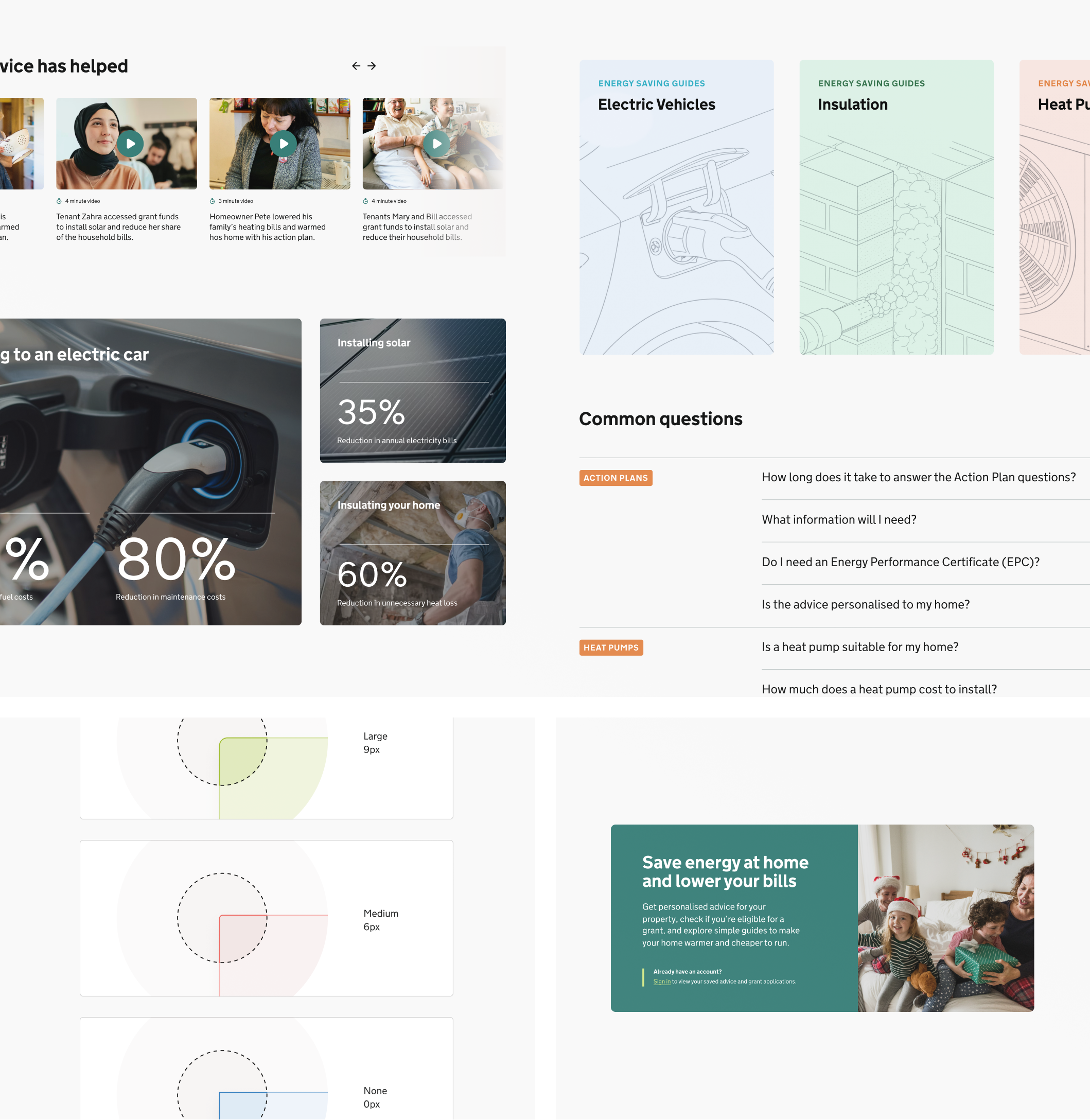
A key concern was how the site, and wider service, was being perceived. Users found the experience flat, bureaucratic and difficult to relate to, making them reluctant to spend time working through the content.
As a result, many left without understanding what the service was for, how it could help them, or why they should trust it.
To address this, I created a renewed creative direction for the site, using GOV.UK standards as the foundation while carefully extending what a government service could feel like through illustration, photography, video and more expressive module styles.
The redesign introduced the warmth, relatability and sense of connection the service had been missing, while retaining the clarity, structure and authority needed to build trust.
Reducing effort, improving understanding
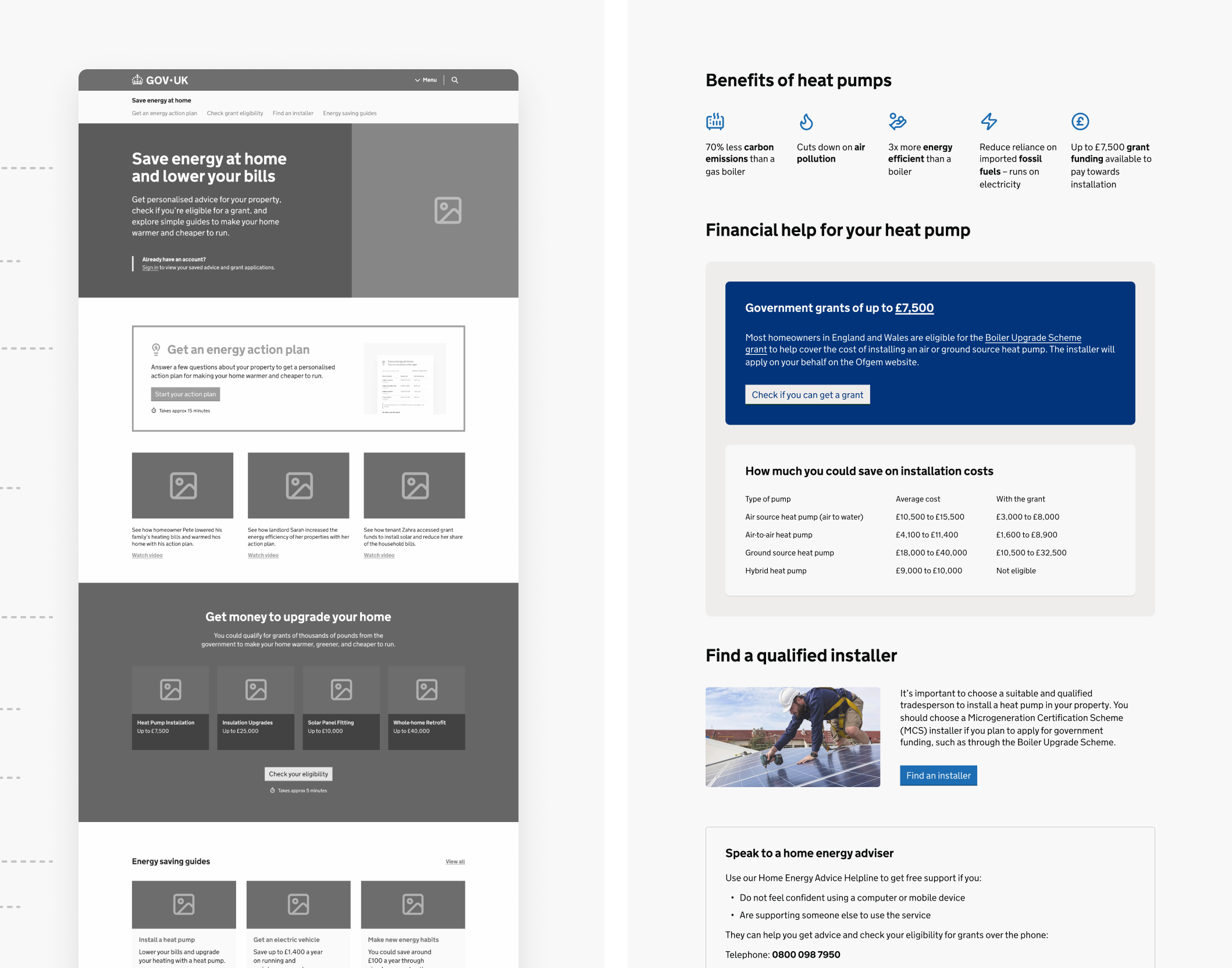
Research showed that users were missing important details like costs, eligibility, savings and timelines because they were either too far down the page, or pushed down by large visuals.
It also showed that people wanted the simpler, more practical information first, with more complex detail introduced later once they had a clearer understanding.
So we reworked the hierarchy across the templates. We made page openings clearer, gave sections a stronger structure, grouped content into more manageable chunks, used tiles and cards to make options easier to scan, and surfaced related actions at more useful points in the journey.
The result was a more guided experience that helped users understand what each page was for, what mattered most, and what to do next.
Creating a micro-brand to encourage action
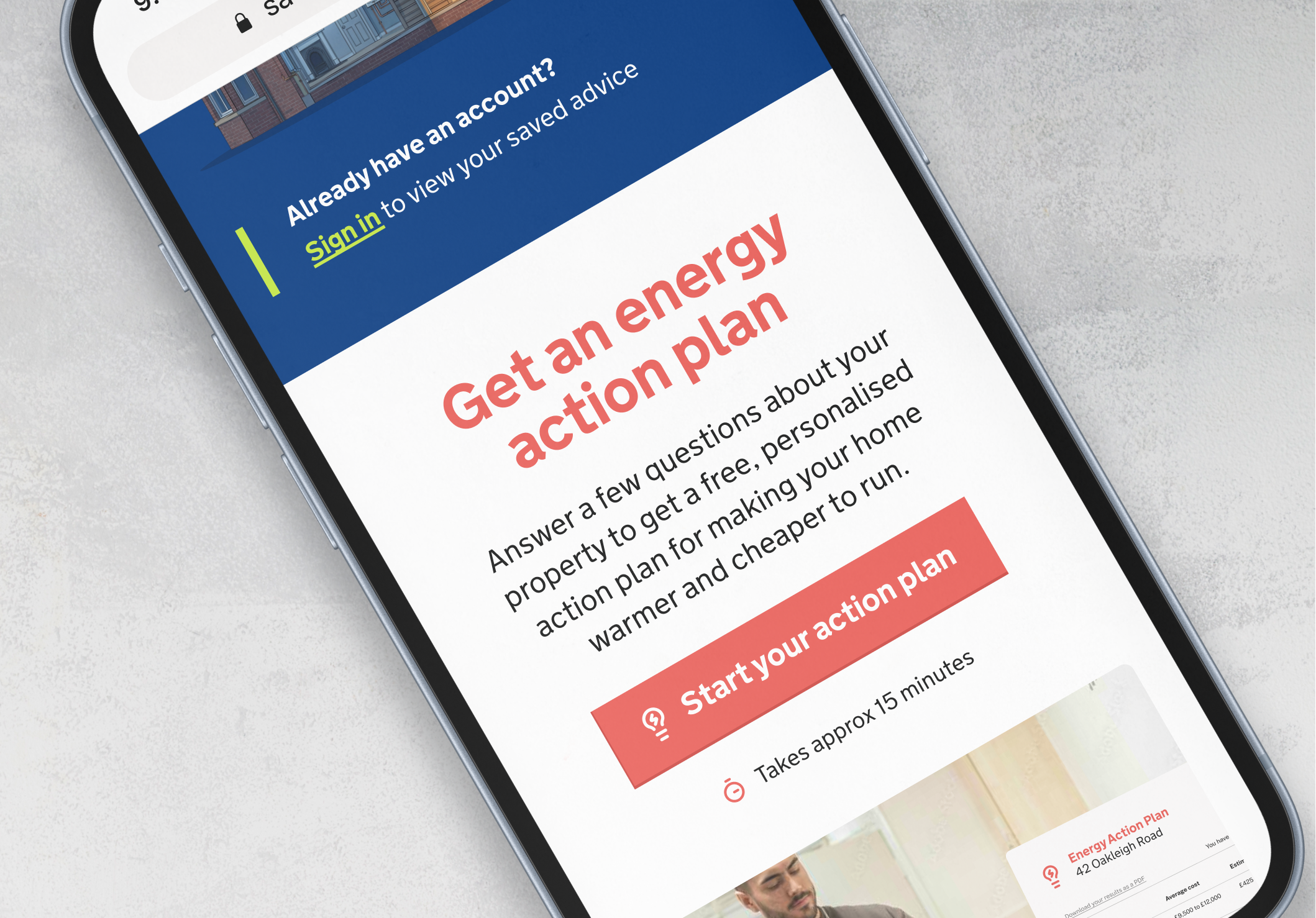
Research showed that users were struggling to understand how to move forward. The site had a useful function that allowed people to answer questions about their home and receive personalised advice, but it was not clear enough what it was, why it mattered, or how it fitted into the wider service.
We turned this into a more prominent, understandable feature called the Energy Action Plan. This gave the service a clearer focal point and helped users understand that the site could do more than provide general information. It could guide them towards specific actions for their own home, including getting funding.
We made the Energy Action Plan one of the most prominent modules across key pages, supported by clearer calls to action and visual examples of what users would receive. This gave people a stronger sense of what to expect, what they could do next, and how the different parts of the service connected.
User testing
View all
The testing focused on whether users could understand the purpose of each page, move through the journey confidently, find key information, interpret labels and calls to action, and understand what to do next. We also used AI tools to speed up the collation and organisation of session data, helping us turn transcripts, recordings and behavioural signals into clear findings in record time.
To understand whether the redesign was working in practice, I planned and ran a round of remote, unmoderated user testing across the service’s key audience groups.
I worked closely with the client throughout, creating a clear documentation trail covering the redesign rationale, proposed testing structure, research objectives and test script. This helped align the team before testing began and gave the findings a clear link back to the decisions we needed to validate.

Remote, unmoderated
32 participants
4 audience groups
Desktop and mobile
Accessibility needs included
Task-based journeys
Screen recordings
Transcript analysis
AI-assisted synthesis
Crafting the report
View all
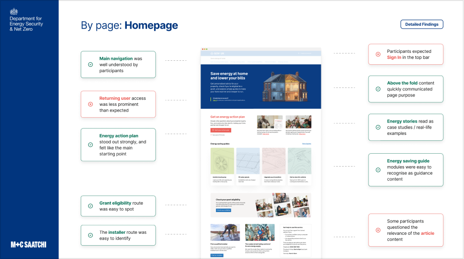
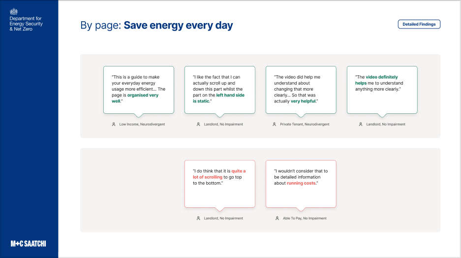
Clear evidence, not opinion. The report brought together spoken feedback, screen recordings, transcripts and behavioural signals to show where the redesigned service was working, where friction remained, and how consistently patterns appeared across the sample.
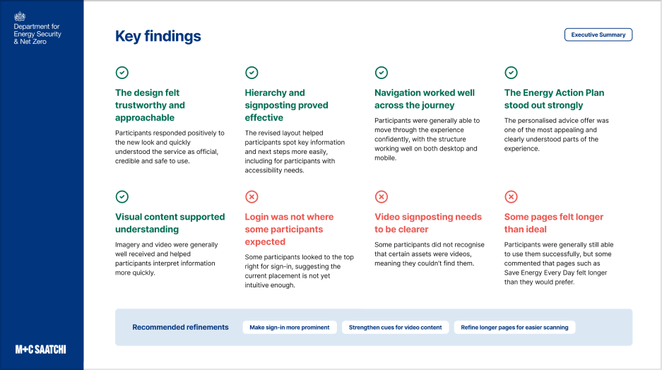
Findings structured around user confidence. We organised the analysis around the things that mattered most to the experience: page purpose, navigation, findability of key information, comprehension, terminology, trust, and the role of imagery and video.
Practical recommendations for delivery. The final report translated the testing into clear outcomes for the team, including what to refine, what to keep using, and what to prioritise next across the remaining templates and build work.
Turning the redesign into a build-ready service
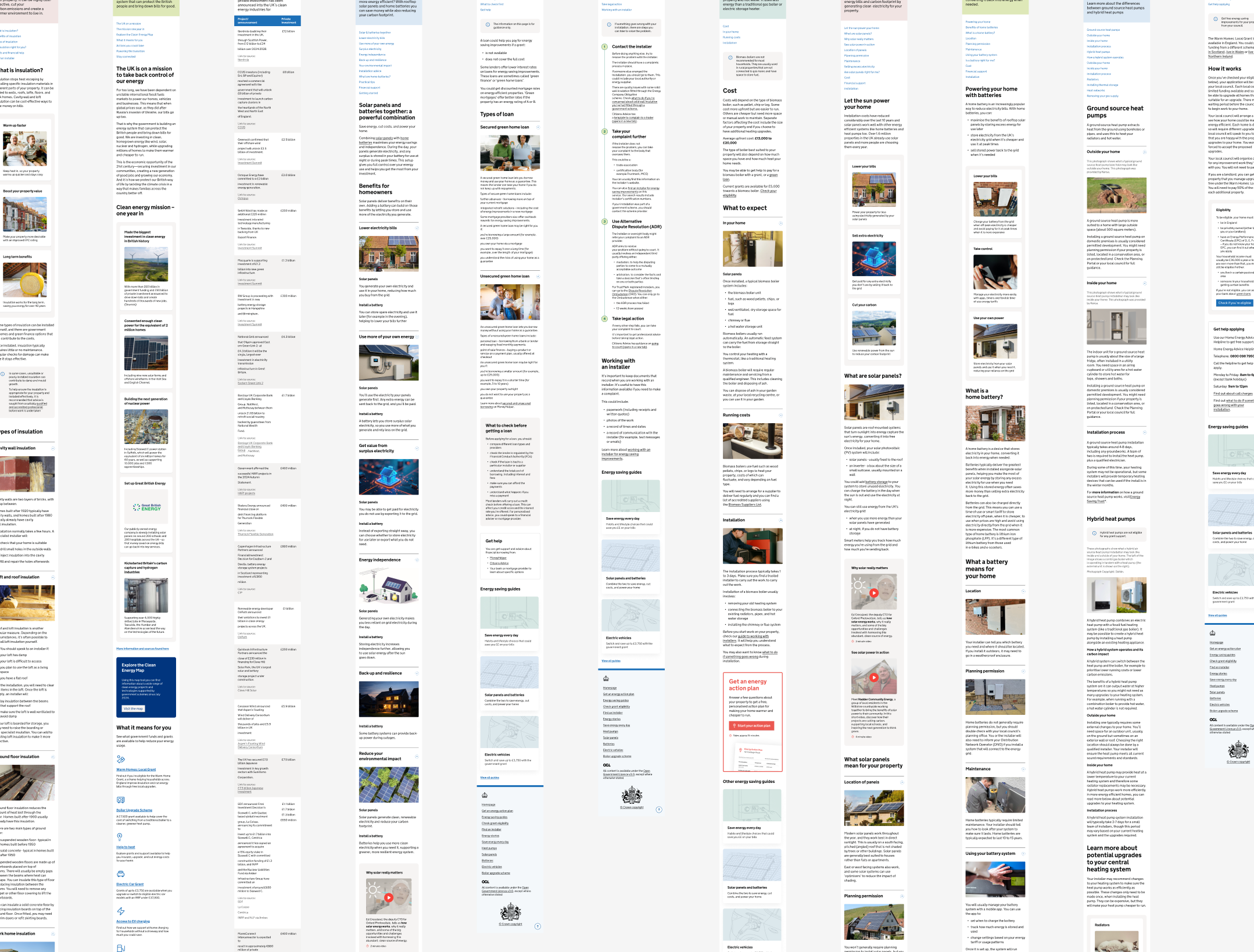
Following the testing and subsequent tweaks, we worked closely with specialist teams across DESNZ to adapt their existing content into the new site structure.
This involved a mix of UX copywriting, detailed UI and template design, and multiple rounds of review and refinement.
I ran large show and tell sessions with stakeholders from across the organisation, sometimes with more than 50 people in the room, to explain the design direction, gather feedback and keep the work moving.
The final output was a clear, developer-friendly design package that gave the build team everything they needed to turn the redesigned service into a live site.
Get in touch
View all
I’m available via chris@chrisberridge.com or LinkedIn.
Case study
View all
M+C Saatchi asked me to lead the redesign of the Department for Energy Security and Net Zero’s Save Energy at Home service.
The challenge
The Save Energy at Home service is a key part of the government’s wider net zero push, aiming to help millions of households move away from fossil fuels and install alternatives such as solar or heat pumps.
Research showed that the service’s website (the main public touchpoint) was not meeting users’ needs. People found the experience overly bureaucratic, difficult to navigate, unclear, and hard to extract practical information from.
My project role
Working with a small M+C team, I led the project end to end, shaping the direction of the redesign and translating research into a clearer, more usable service.
I ran large-scale workshops, defined the UX and visual direction, created a scalable template system, planned and undertook the user testing, and carried the work through iterative refinement and into build.
Activities
View all
Project leadership
User research
Workshop facilitation
Creative direction
User experience design
Product design
Information architecture
User interface design
Rapid prototyping
User testing
A renewed creative direction
A key concern was how the site, and wider service, was being perceived. Users found the experience flat, bureaucratic and difficult to relate to, making them reluctant to spend time working through the content.
As a result, many left without understanding what the service was for, how it could help them, or why they should trust it.
To address this, I created a renewed creative direction for the site, using GOV.UK standards as the foundation while carefully extending what a government service could feel like through illustration, photography, video and more expressive module styles.
The redesign introduced the warmth, relatability and sense of connection the service had been missing, while retaining the clarity, structure and authority needed to build trust.
Reducing effort, improving understanding
View all
Research showed that users were missing important details like costs, eligibility, savings and timelines because they were either too far down the page, or pushed down by large visuals.
It also showed that people wanted the simpler, more practical information first, with more complex detail introduced later once they had a clearer understanding.
So we reworked the hierarchy across the templates. We made page openings clearer, gave sections a stronger structure, grouped content into more manageable chunks, used tiles and cards to make options easier to scan, and surfaced related actions at more useful points in the journey.
The result was a more guided experience that helped users understand what each page was for, what mattered most, and what to do next.
Creating a micro-brand to encourage action
View all
Research showed that users were struggling to understand how to move forward. The site had a useful function that allowed people to answer questions about their home and receive personalised advice, but it was not clear enough what it was, why it mattered, or how it fitted into the wider service.
We turned this into a more prominent, understandable feature called the Energy Action Plan. This gave the service a clearer focal point and helped users understand that the site could do more than provide general information. It could guide them towards specific actions for their own home, including getting funding.
We made the Energy Action Plan one of the most prominent modules across key pages, supported by clearer calls to action and visual examples of what users would receive. This gave people a stronger sense of what to expect, what they could do next, and how the different parts of the service connected.
User testing
View all
The testing focused on whether users could understand the purpose of each page, move through the journey confidently, find key information, interpret labels and calls to action, and understand what to do next. We also used AI tools to speed up the collation and organisation of session data, helping us turn transcripts, recordings and behavioural signals into clear findings in record time.
To understand whether the redesign was working in practice, I planned and ran a round of remote, unmoderated user testing across the service’s key audience groups.
I worked closely with the client throughout, creating a clear documentation trail covering the redesign rationale, proposed testing structure, research objectives and test script. This helped align the team before testing began and gave the findings a clear link back to the decisions we needed to validate.
Remote, unmoderated
32 participants
4 audience groups
Desktop and mobile
Accessibility needs included
Task-based journeys
Screen recordings
Transcript analysis
AI-assisted synthesis
Crafting the report
View all
Clear evidence, not opinion. The report brought together spoken feedback, screen recordings, transcripts and behavioural signals to show where the redesigned service was working, where friction remained, and how consistently patterns appeared across the sample.
Findings structured around user confidence. We organised the analysis around the things that mattered most to the experience: page purpose, navigation, findability of key information, comprehension, terminology, trust, and the role of imagery and video.
Practical recommendations for delivery. The final report translated the testing into clear outcomes for the team, including what to refine, what to keep using, and what to prioritise next across the remaining templates and build work.
Turning the redesign into a build-ready service
View all
Following the testing and subsequent tweaks, we worked closely with specialist teams across DESNZ to adapt their existing content into the new site structure.
This involved a mix of UX copywriting, detailed UI and template design, and multiple rounds of review and refinement.
I ran large show and tell sessions with stakeholders from across the organisation, sometimes with more than 50 people in the room, to explain the design direction, gather feedback and keep the work moving.
The final output was a clear, developer-friendly design package that gave the build team everything they needed to turn the redesigned service into a live site.
Get in touch
View all
I’m available via chris@chrisberridge.com or LinkedIn.


Case study
View all
M+C Saatchi asked me to lead the redesign of the Department for Energy Security and Net Zero’s Save Energy at Home service.
The challenge
The Save Energy at Home service is a key part of the government’s wider net zero push, aiming to help millions of households move away from fossil fuels and install alternatives such as solar or heat pumps.
Research showed that the service’s website (the main public touchpoint) was not meeting users’ needs. People found the experience overly bureaucratic, difficult to navigate, unclear, and hard to extract practical information from.
My project role
Working with a small M+C team, I led the project end to end, shaping the direction of the redesign and translating research into a clearer, more usable service.
I ran large-scale workshops, defined the UX and visual direction, created a scalable template system, planned and undertook the user testing, and carried the work through iterative refinement and into build.
Activities
View all
Project leadership
User research
Workshop facilitation
Creative direction
User experience design
Product design
Information architecture
User interface design
Rapid prototyping
User testing
A renewed creative direction
A key concern was how the site, and wider service, was being perceived. Users found the experience flat, bureaucratic and difficult to relate to, making them reluctant to spend time working through the content.
As a result, many left without understanding what the service was for, how it could help them, or why they should trust it.
To address this, I created a renewed creative direction for the site, using GOV.UK standards as the foundation while carefully extending what a government service could feel like through illustration, photography, video and more expressive module styles.
The redesign introduced the warmth, relatability and sense of connection the service had been missing, while retaining the clarity, structure and authority needed to build trust.
Reducing effort, improving understanding
View all
Research showed that users were missing important details like costs, eligibility, savings and timelines because they were either too far down the page, or pushed down by large visuals.
It also showed that people wanted the simpler, more practical information first, with more complex detail introduced later once they had a clearer understanding.
So we reworked the hierarchy across the templates. We made page openings clearer, gave sections a stronger structure, grouped content into more manageable chunks, used tiles and cards to make options easier to scan, and surfaced related actions at more useful points in the journey.
The result was a more guided experience that helped users understand what each page was for, what mattered most, and what to do next.
Creating a micro-brand to encourage action
View all
Research showed that users were struggling to understand how to move forward. The site had a useful function that allowed people to answer questions about their home and receive personalised advice, but it was not clear enough what it was, why it mattered, or how it fitted into the wider service.
We turned this into a more prominent, understandable feature called the Energy Action Plan. This gave the service a clearer focal point and helped users understand that the site could do more than provide general information. It could guide them towards specific actions for their own home, including getting funding.
We made the Energy Action Plan one of the most prominent modules across key pages, supported by clearer calls to action and visual examples of what users would receive. This gave people a stronger sense of what to expect, what they could do next, and how the different parts of the service connected.
User testing
View all
The testing focused on whether users could understand the purpose of each page, move through the journey confidently, find key information, interpret labels and calls to action, and understand what to do next. We also used AI tools to speed up the collation and organisation of session data, helping us turn transcripts, recordings and behavioural signals into clear findings in record time.
To understand whether the redesign was working in practice, I planned and ran a round of remote, unmoderated user testing across the service’s key audience groups.
I worked closely with the client throughout, creating a clear documentation trail covering the redesign rationale, proposed testing structure, research objectives and test script. This helped align the team before testing began and gave the findings a clear link back to the decisions we needed to validate.
Remote, unmoderated
32 participants
4 audience groups
Desktop and mobile
Accessibility needs included
Task-based journeys
Screen recordings
Transcript analysis
AI-assisted synthesis
Crafting the report
View all
Clear evidence, not opinion. The report brought together spoken feedback, screen recordings, transcripts and behavioural signals to show where the redesigned service was working, where friction remained, and how consistently patterns appeared across the sample.
Findings structured around user confidence. We organised the analysis around the things that mattered most to the experience: page purpose, navigation, findability of key information, comprehension, terminology, trust, and the role of imagery and video.
Practical recommendations for delivery. The final report translated the testing into clear outcomes for the team, including what to refine, what to keep using, and what to prioritise next across the remaining templates and build work.
Turning the redesign into a build-ready service
View all
Following the testing and subsequent tweaks, we worked closely with specialist teams across DESNZ to adapt their existing content into the new site structure.
This involved a mix of UX copywriting, detailed UI and template design, and multiple rounds of review and refinement.
I ran large show and tell sessions with stakeholders from across the organisation, sometimes with more than 50 people in the room, to explain the design direction, gather feedback and keep the work moving.
The final output was a clear, developer-friendly design package that gave the build team everything they needed to turn the redesigned service into a live site.
Get in touch
View all
I’m available via chris@chrisberridge.com or LinkedIn.
Case study
View all
M+C Saatchi asked me to lead the redesign of the Department for Energy Security and Net Zero’s Save Energy at Home service.
The challenge
The Save Energy at Home service is a key part of the government’s wider net zero push, aiming to help millions of households move away from fossil fuels and install alternatives such as solar or heat pumps.
Research showed that the service’s website (the main public touchpoint) was not meeting users’ needs. People found the experience overly bureaucratic, difficult to navigate, unclear, and hard to extract practical information from.
My project role
Working with a small M+C team, I led the project end to end, shaping the direction of the redesign and translating research into a clearer, more usable service.
I ran large-scale workshops, defined the UX and visual direction, created a scalable template system, planned and undertook the user testing, and carried the work through iterative refinement and into build.
Activities
View all
Project leadership
User research
Workshop facilitation
Creative direction
User experience design
Product design
Information architecture
User interface design
Rapid prototyping
User testing
A renewed creative direction
A key concern was how the site, and wider service, was being perceived. Users found the experience flat, bureaucratic and difficult to relate to, making them reluctant to spend time working through the content.
As a result, many left without understanding what the service was for, how it could help them, or why they should trust it.
To address this, I created a renewed creative direction for the site, using GOV.UK standards as the foundation while carefully extending what a government service could feel like through illustration, photography, video and more expressive module styles.
The redesign introduced the warmth, relatability and sense of connection the service had been missing, while retaining the clarity, structure and authority needed to build trust.
Reducing effort, improving understanding
View all
Research showed that users were missing important details like costs, eligibility, savings and timelines because they were either too far down the page, or pushed down by large visuals.
It also showed that people wanted the simpler, more practical information first, with more complex detail introduced later once they had a clearer understanding.
So we reworked the hierarchy across the templates. We made page openings clearer, gave sections a stronger structure, grouped content into more manageable chunks, used tiles and cards to make options easier to scan, and surfaced related actions at more useful points in the journey.
The result was a more guided experience that helped users understand what each page was for, what mattered most, and what to do next.
Creating a micro-brand to encourage action
View all
Research showed that users were struggling to understand how to move forward. The site had a useful function that allowed people to answer questions about their home and receive personalised advice, but it was not clear enough what it was, why it mattered, or how it fitted into the wider service.
We turned this into a more prominent, understandable feature called the Energy Action Plan. This gave the service a clearer focal point and helped users understand that the site could do more than provide general information. It could guide them towards specific actions for their own home, including getting funding.
We made the Energy Action Plan one of the most prominent modules across key pages, supported by clearer calls to action and visual examples of what users would receive. This gave people a stronger sense of what to expect, what they could do next, and how the different parts of the service connected.
User testing
View all
The testing focused on whether users could understand the purpose of each page, move through the journey confidently, find key information, interpret labels and calls to action, and understand what to do next. We also used AI tools to speed up the collation and organisation of session data, helping us turn transcripts, recordings and behavioural signals into clear findings in record time.
To understand whether the redesign was working in practice, I planned and ran a round of remote, unmoderated user testing across the service’s key audience groups.
I worked closely with the client throughout, creating a clear documentation trail covering the redesign rationale, proposed testing structure, research objectives and test script. This helped align the team before testing began and gave the findings a clear link back to the decisions we needed to validate.
Remote, unmoderated
32 participants
4 audience groups
Desktop and mobile
Accessibility needs included
Task-based journeys
Screen recordings
Transcript analysis
AI-assisted synthesis
Crafting the report
View all
Clear evidence, not opinion. The report brought together spoken feedback, screen recordings, transcripts and behavioural signals to show where the redesigned service was working, where friction remained, and how consistently patterns appeared across the sample.
Findings structured around user confidence. We organised the analysis around the things that mattered most to the experience: page purpose, navigation, findability of key information, comprehension, terminology, trust, and the role of imagery and video.
Practical recommendations for delivery. The final report translated the testing into clear outcomes for the team, including what to refine, what to keep using, and what to prioritise next across the remaining templates and build work.
Turning the redesign into a build-ready service
View all
Following the testing and subsequent tweaks, we worked closely with specialist teams across DESNZ to adapt their existing content into the new site structure.
This involved a mix of UX copywriting, detailed UI and template design, and multiple rounds of review and refinement.
I ran large show and tell sessions with stakeholders from across the organisation, sometimes with more than 50 people in the room, to explain the design direction, gather feedback and keep the work moving.
The final output was a clear, developer-friendly design package that gave the build team everything they needed to turn the redesigned service into a live site.
Get in touch
View all
I’m available via chris@chrisberridge.com or LinkedIn.
Case study
View all
M+C Saatchi asked me to lead the redesign of the Department for Energy Security and Net Zero’s Save Energy at Home service.
The challenge
The Save Energy at Home service is a key part of the government’s wider net zero push, aiming to help millions of households move away from fossil fuels and install alternatives such as solar or heat pumps.
Research showed that the service’s website (the main public touchpoint) was not meeting users’ needs. People found the experience overly bureaucratic, difficult to navigate, unclear, and hard to extract practical information from.
My project role
Working with a small M+C team, I led the project end to end, shaping the direction of the redesign and translating research into a clearer, more usable service.
I ran large-scale workshops, defined the UX and visual direction, created a scalable template system, planned and undertook the user testing, and carried the work through iterative refinement and into build.
Activities
View all
Project leadership
User research
Workshop facilitation
Creative direction
User experience design
Product design
Information architecture
User interface design
Rapid prototyping
User testing
A renewed creative direction
A key concern was how the site, and wider service, was being perceived. Users found the experience flat, bureaucratic and difficult to relate to, making them reluctant to spend time working through the content.
As a result, many left without understanding what the service was for, how it could help them, or why they should trust it.
To address this, I created a renewed creative direction for the site, using GOV.UK standards as the foundation while carefully extending what a government service could feel like through illustration, photography, video and more expressive module styles.
The redesign introduced the warmth, relatability and sense of connection the service had been missing, while retaining the clarity, structure and authority needed to build trust.
Reducing effort, improving understanding
View all
Research showed that users were missing important details like costs, eligibility, savings and timelines because they were either too far down the page, or pushed down by large visuals.
It also showed that people wanted the simpler, more practical information first, with more complex detail introduced later once they had a clearer understanding.
So we reworked the hierarchy across the templates. We made page openings clearer, gave sections a stronger structure, grouped content into more manageable chunks, used tiles and cards to make options easier to scan, and surfaced related actions at more useful points in the journey.
The result was a more guided experience that helped users understand what each page was for, what mattered most, and what to do next.
Creating a micro-brand to encourage action
View all
Research showed that users were struggling to understand how to move forward. The site had a useful function that allowed people to answer questions about their home and receive personalised advice, but it was not clear enough what it was, why it mattered, or how it fitted into the wider service.
We turned this into a more prominent, understandable feature called the Energy Action Plan. This gave the service a clearer focal point and helped users understand that the site could do more than provide general information. It could guide them towards specific actions for their own home, including getting funding.
We made the Energy Action Plan one of the most prominent modules across key pages, supported by clearer calls to action and visual examples of what users would receive. This gave people a stronger sense of what to expect, what they could do next, and how the different parts of the service connected.
User testing
View all
To understand whether the redesign was working in practice, I planned and ran a round of remote, unmoderated user testing across the service’s key audience groups.
I worked closely with the client throughout, creating a clear documentation trail covering the redesign rationale, proposed testing structure, research objectives and test script. This helped align the team before testing began and gave the findings a clear link back to the decisions we needed to validate.
The testing focused on whether users could understand the purpose of each page, move through the journey confidently, find key information, interpret labels and calls to action, and understand what to do next. We also used AI tools to speed up the collation and organisation of session data, helping us turn transcripts, recordings and behavioural signals into clear findings in record time.
Remote, unmoderated
32 participants
4 audience groups
Desktop and mobile
Accessibility needs included
Task-based journeys
Screen recordings
Transcript analysis
AI-assisted synthesis
Crafting the report
View all
Clear evidence, not opinion. The report brought together spoken feedback, screen recordings, transcripts and behavioural signals to show where the redesigned service was working, where friction remained, and how consistently patterns appeared across the sample.
Findings structured around user confidence. We organised the analysis around the things that mattered most to the experience: page purpose, navigation, findability of key information, comprehension, terminology, trust, and the role of imagery and video.
Practical recommendations for delivery. The final report translated the testing into clear outcomes for the team, including what to refine, what to keep using, and what to prioritise next across the remaining templates and build work.
Turning the redesign into a build-ready service
View all
Following the testing and subsequent tweaks, we worked closely with specialist teams across DESNZ to adapt their existing content into the new site structure.
This involved a mix of UX copywriting, detailed UI and template design, and multiple rounds of review and refinement.
I ran large show and tell sessions with stakeholders from across the organisation, sometimes with more than 50 people in the room, to explain the design direction, gather feedback and keep the work moving.
The final output was a clear, developer-friendly design package that gave the build team everything they needed to turn the redesigned service into a live site.
Get in touch
View all
I’m available via chris@chrisberridge.com or LinkedIn.


Case study
View all
M+C Saatchi asked me to lead the redesign of the Department for Energy Security and Net Zero’s Save Energy at Home service.
The challenge
The Save Energy at Home service is a key part of the government’s wider net zero push, aiming to help millions of households move away from fossil fuels and install alternatives such as solar or heat pumps.
Research showed that the service’s website (the main public touchpoint) was not meeting users’ needs. People found the experience overly bureaucratic, difficult to navigate, unclear, and hard to extract practical information from.
My project role
Working with a small M+C team, I led the project end to end, shaping the direction of the redesign and translating research into a clearer, more usable service.
I ran large-scale workshops, defined the UX and visual direction, created a scalable template system, planned and undertook the user testing, and carried the work through iterative refinement and into build.
Activities
View all
Project leadership
User research
Workshop facilitation
Creative direction
User experience design
Product design
Information architecture
User interface design
Rapid prototyping
User testing
A renewed creative direction
A key concern was how the site, and wider service, was being perceived. Users found the experience flat, bureaucratic and difficult to relate to, making them reluctant to spend time working through the content.
As a result, many left without understanding what the service was for, how it could help them, or why they should trust it.
To address this, I created a renewed creative direction for the site, using GOV.UK standards as the foundation while carefully extending what a government service could feel like through illustration, photography, video and more expressive module styles.
The redesign introduced the warmth, relatability and sense of connection the service had been missing, while retaining the clarity, structure and authority needed to build trust.
Reducing effort, improving understanding
View all
Research showed that users were missing important details like costs, eligibility, savings and timelines because they were either too far down the page, or pushed down by large visuals.
It also showed that people wanted the simpler, more practical information first, with more complex detail introduced later once they had a clearer understanding.
So we reworked the hierarchy across the templates. We made page openings clearer, gave sections a stronger structure, grouped content into more manageable chunks, used tiles and cards to make options easier to scan, and surfaced related actions at more useful points in the journey.
The result was a more guided experience that helped users understand what each page was for, what mattered most, and what to do next.
Creating a micro-brand to encourage action
View all
Research showed that users were struggling to understand how to move forward. The site had a useful function that allowed people to answer questions about their home and receive personalised advice, but it was not clear enough what it was, why it mattered, or how it fitted into the wider service.
We turned this into a more prominent, understandable feature called the Energy Action Plan. This gave the service a clearer focal point and helped users understand that the site could do more than provide general information. It could guide them towards specific actions for their own home, including getting funding.
We made the Energy Action Plan one of the most prominent modules across key pages, supported by clearer calls to action and visual examples of what users would receive. This gave people a stronger sense of what to expect, what they could do next, and how the different parts of the service connected.
User testing
View all
To understand whether the redesign was working in practice, I planned and ran a round of remote, unmoderated user testing across the service’s key audience groups.
I worked closely with the client throughout, creating a clear documentation trail covering the redesign rationale, proposed testing structure, research objectives and test script. This helped align the team before testing began and gave the findings a clear link back to the decisions we needed to validate.
The testing focused on whether users could understand the purpose of each page, move through the journey confidently, find key information, interpret labels and calls to action, and understand what to do next. We also used AI tools to speed up the collation and organisation of session data, helping us turn transcripts, recordings and behavioural signals into clear findings in record time.
Remote, unmoderated
32 participants
4 audience groups
Desktop and mobile
Accessibility needs included
Task-based journeys
Screen recordings
Transcript analysis
AI-assisted synthesis
Crafting the report
View all
Clear evidence, not opinion. The report brought together spoken feedback, screen recordings, transcripts and behavioural signals to show where the redesigned service was working, where friction remained, and how consistently patterns appeared across the sample.
Findings structured around user confidence. We organised the analysis around the things that mattered most to the experience: page purpose, navigation, findability of key information, comprehension, terminology, trust, and the role of imagery and video.
Practical recommendations for delivery. The final report translated the testing into clear outcomes for the team, including what to refine, what to keep using, and what to prioritise next across the remaining templates and build work.
Turning the redesign into a build-ready service
View all
Following the testing and subsequent tweaks, we worked closely with specialist teams across DESNZ to adapt their existing content into the new site structure.
This involved a mix of UX copywriting, detailed UI and template design, and multiple rounds of review and refinement.
I ran large show and tell sessions with stakeholders from across the organisation, sometimes with more than 50 people in the room, to explain the design direction, gather feedback and keep the work moving.
The final output was a clear, developer-friendly design package that gave the build team everything they needed to turn the redesigned service into a live site.
Get in touch
View all
I’m available via chris@chrisberridge.com or LinkedIn.